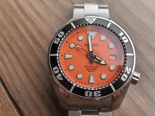
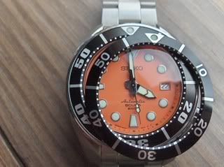
I'm kind of excited about this one. I bought a bezel insert from Harold (yabokies) last week as soon as I saw it available here on the forum & it turns out I'm his first customer for one. True to form, it arrived yesterday & it will be my weekend project to replace it (pictures to follow if all goes well!). Here's some shots of the old/new & side by side. This is a big improvement over the "NASCAR" numbers (as Gabe calls them) that has been the subject of one or two threads along the way. I'm sort of torn right now as I've really come to like the original one. Anyway, here's the pictures; as always, comments are welcome. What do you think??
![Image]()
![Image]()


