The Watch Site banner

New Sumo bezel insert!

5.5K views 13 replies 13 participants last post by  seikomatic  
#1 ·
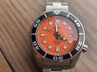
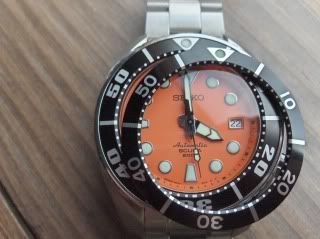
I'm kind of excited about this one. I bought a bezel insert from Harold (yabokies) last week as soon as I saw it available here on the forum & it turns out I'm his first customer for one. True to form, it arrived yesterday & it will be my weekend project to replace it (pictures to follow if all goes well!). Here's some shots of the old/new & side by side. This is a big improvement over the "NASCAR" numbers (as Gabe calls them) that has been the subject of one or two threads along the way. I'm sort of torn right now as I've really come to like the original one. Anyway, here's the pictures; as always, comments are welcome. What do you think??

Image
Image
 
#8 ·
I never had a problem with the larger font numbers on the Sumo, in fact that's the reason I went with this bezel on a 6309 mod because I didn't feel like shelling out the dough when I could settle for mod-homage or should that be "homod?
Either one works there Paul and as they say, wear it in good health!


Image
 
#13 ·
Now I think I understand why Seiko made the font bold and wide. It's because they want to put the minute marker dots below the numbers and on "the other side" to make the bezel looks classier by being unbusy. But the lack of dots creates blank spaces so Seiko made the font fat and wide to "fill" them or to create more balance look.....